

Military Family Realty
Real Estate Company
Rebranding • Identity Design
Adobe Illustrator • Adobe Photoshop
Helping families buy and sell homes for more than 35 years.
branding


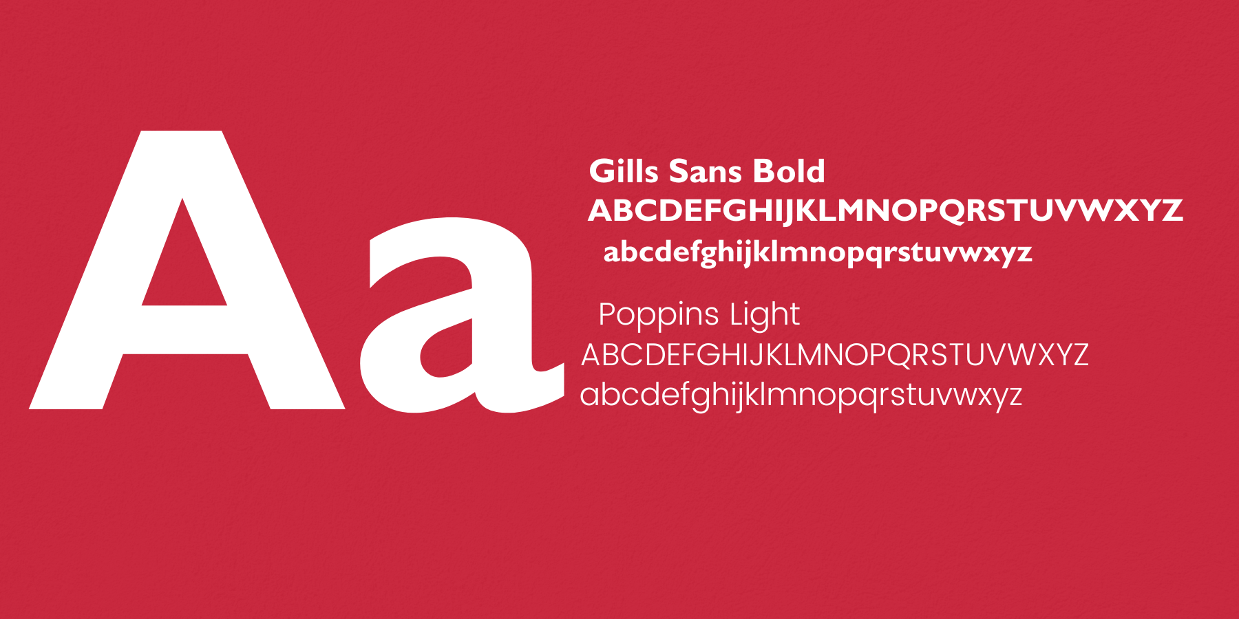
This company sought to rebrand themselves to better fit their own personal vision. Since they still operate under the main company for MFR, the original logo, for the time being, must still be utilized in the new one. For this new logo I intended to make it more clear that this company is real estate by utilizing that of a house and using a star to show homage to that of the army star. The original logo is very ambiguous and I chose to make the logo have more clear definition to it. I utilized the original logo colors and added a lighter red for the main portion of the logo. The logo I created is meant to be welcoming, approachable, and friendly-just like that of the company.
about


identity design

identity
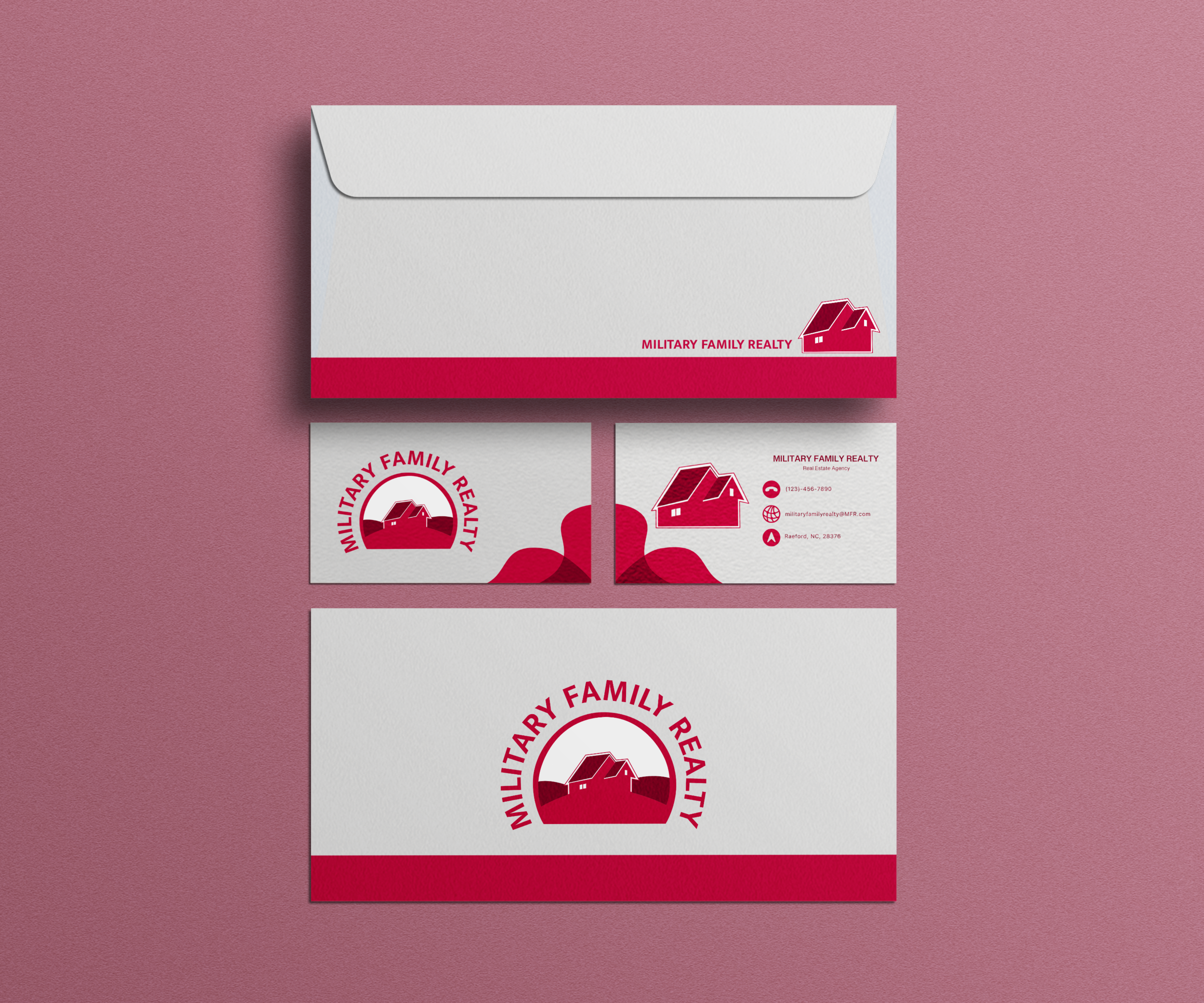
This real estate company needed simplistic products for their company, only needing a business card and an envelope to be designed. For these identity products, we strove to showcase the company as professional and to-the-point. We kept these designs minimal and polished. With this we kept things simple with all of the available contact information needed.